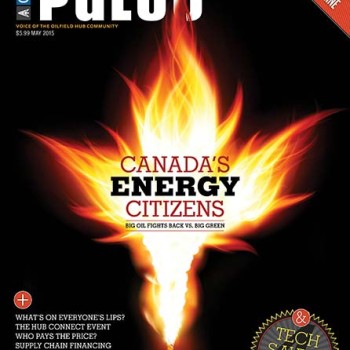
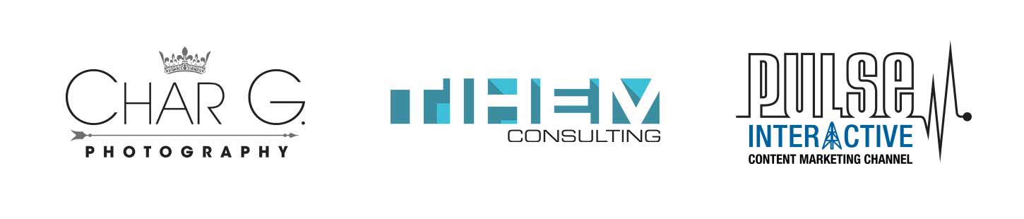
Added a few more logos to the Branding section in my portfolio. A bit different from what I currently have in there. Goes without saying that every company is different, and should have their own personality. Photography logos are generally pretty minimal and classy, however obviously personal to the photographer so a crown was added to reflect some of her heritage. The TIHEM logo was actually one of those “got to have it in an hour” type of logos so not a lot of rational that went into that one, and it was done more to satisfy my need to do a negative space type of logo that I’ve been wanting to do for a while. PULSE Interactive was also a quick one but had it in my mind for a while how to improve the existing logo. The Derek was asked for after the logo was designed, and was fortunate the “A” aligned in the exact middle.